Monday, 24 December 2012
Sunday, 23 December 2012
Wednesday, 19 December 2012
Peer feedback on a draft of one front cover
Positives
'All features included - mast head, coverlines etc'
'Layed out well, good position of text'
'Small details like barcode, follows typical conventions'
Negatives
'Image doesn't exactually represent genre'
'Photo could be better quality'
'Add a tease at the bottom? Make it more appealing with that?'
As a result of this feedback I will add a tease to my magazine, try to use a photo that represents my genre.
Tuesday, 18 December 2012
Before and after picture using photoshop
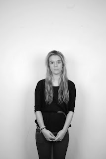
This is what the original photo looks like.
This is what the final photograph looks like after I have edited it in photoshop.
I started off by selecting the skin on her body so that I could eventually make it airbrushed.
Once I had cut aound her skin I made a new layer and coppied it over, this screen shot shows how I made her skin go blurry.
After I had selected just her skin, I then rubbed out her lips and eyes so that when I put it back together at the end these remained the same to create a more realistic look. At this stage I also played around with the effect to try and get rid of her spots on her face and her freckles. I found that blurring the image was the best way to do this.
I then added the skin back onto the original image, and you can see that all her skin is blurred but her eyes and mouth have remained the same.
I then needed to work on getting the skin to look as natural as possible and not all blurry.
I then played with the colour of her skin to get the best result possible and sometimes you can find that by having different layers in different colours and features it can create a more realistic look.
In the above print screen she looks to dark and fake so I toned her down a bit.
I kept changing her skin colour a bit at a time until I was happy with what it looked like, and this is my final eddited image.
The process of creating one of my draft magazine covers
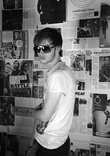
This is the photo I have chosen to use for a draft of my magzine cover.

I then added in the name of the magazine.
I then decided that I would put the text behind my model as this is conventional of some magazines. This step was quite hard to do because of his hair.
Next i added my barcode and date, I decided to put it on its side and at the end of 'RISE' instead of underneath because it was too long and meant that it went over the model and dissapeared as its a similar colour.
I then added some text down either side, I had to make sure the text was bold and dark enough to be read over the model.
I chnaged the brightness of the picture so it was easier to read the black text.
I have now added the price of the magazine and made it stand out on a red background so it draws in the audiences attention.
I felt the bottom of the magazine looked a bit empty so I added something to get attention from the reader.
Monday, 3 December 2012
Drafts of front cover
I have started drafting another front cover, but I have changed the image I have used and have also how the price is displayed in the top right corner. Another thing I have done is created my own bar code, that now has the name of my magazine, the date of the issue and the price in pounds and American dollars. I also think this photo is better quality.
I have added some text which I have made different to the previous time I added articles, I think putting the grey being the text makes it stand out more and draws the attention of the reader or some one looking at the front cover. It also links to the black and white photo of my model.
On this photo I have placed the name of the magazine behind the model as this is how a lot of magazines lay out their front covers. I had to be careful not to hide too much of the text behind the image though because it can make it hard to see the name of the magazine. I have changed where the date is placed on this one and have put it sideways at the end of 'RISE' instead of underneath, I have also moved the price of the magazine.
Subscribe to:
Comments (Atom)


